
In 2023 Loblaw Digital began an ambitious journey to replatform the
e-commerce portfolio, transitioning all of our backend services to a single unified set of platform micro-services, aligning disparate codebases, breaking free of monoliths and enabling all businesses to build faster on a unified foundation of technical capabilities.
On the front end, we had an opportunity to reimagine our core e-commerce customer experiences, with reusable components and patterns and the establishment of a design system. Giving customers familiarity across our ecosystem of digital products and our diverse range of unique brands.
Loblaw is Canada’s Food and Health retail leader and our portfolio of businesses span groceries, beauty, health and wellness, apparel as well payments and loyalty. Our mission to unite our digital properties demanded we align divergent experiences, differing brands, locked in patterns and ways of working that had been driven by individual business leaders and product and tech teams that were responsible for building and maintaining their own individual businesses.

Our design team <3 with our PMs Dagmara & Jonathan
As a design lead I was responsible for managing the two designers Tara Caldwell and Jean-Phillipe “JP” Davidson working on experience design support for the sprint teams tasked with building new platform-lead pages and experiences. We were also tightly partnered with James Harrison, our Staff Product Designer who was leading the design system. Our team structure afforded us a stable balance of “the how”, James was strategizing on codifying our design system. With “the what”, Tara, JP and myself could think hard about what a baseline platform driven e-commerce experience looks like across our mobile and web applications and what unique needs each individual business has.
Our director Eiko Kawano and later Laura Schaefer worked alongside us all to champion our efforts to product, tech and business leadership. All together we were coupled with our engineering team tasked with architecting a new approach to front end development leveraging Server-Driven UI (SDUI) that would give the engineering team a common methodology and codebase for our front-end UI.
With a task this big it can be difficult to know where to start, to help us break through the initial ambiguity I suggested we do a current state audit of our existing experiences. Much of our team was joining from our online grocery team so this exercise gave us a chance at some deeper immersion into our other e-commerce businesses, Shoppers Drug Mart and Joe Fresh. We explored our browse experience across our brands and platforms, analyzing key screens and templates, as well the key interactions to document patterns, heuristics and considerations. We were able to explore how we design experiences from a platform driven lens and had a chance to step outside the design considerations of the single business we worked on.
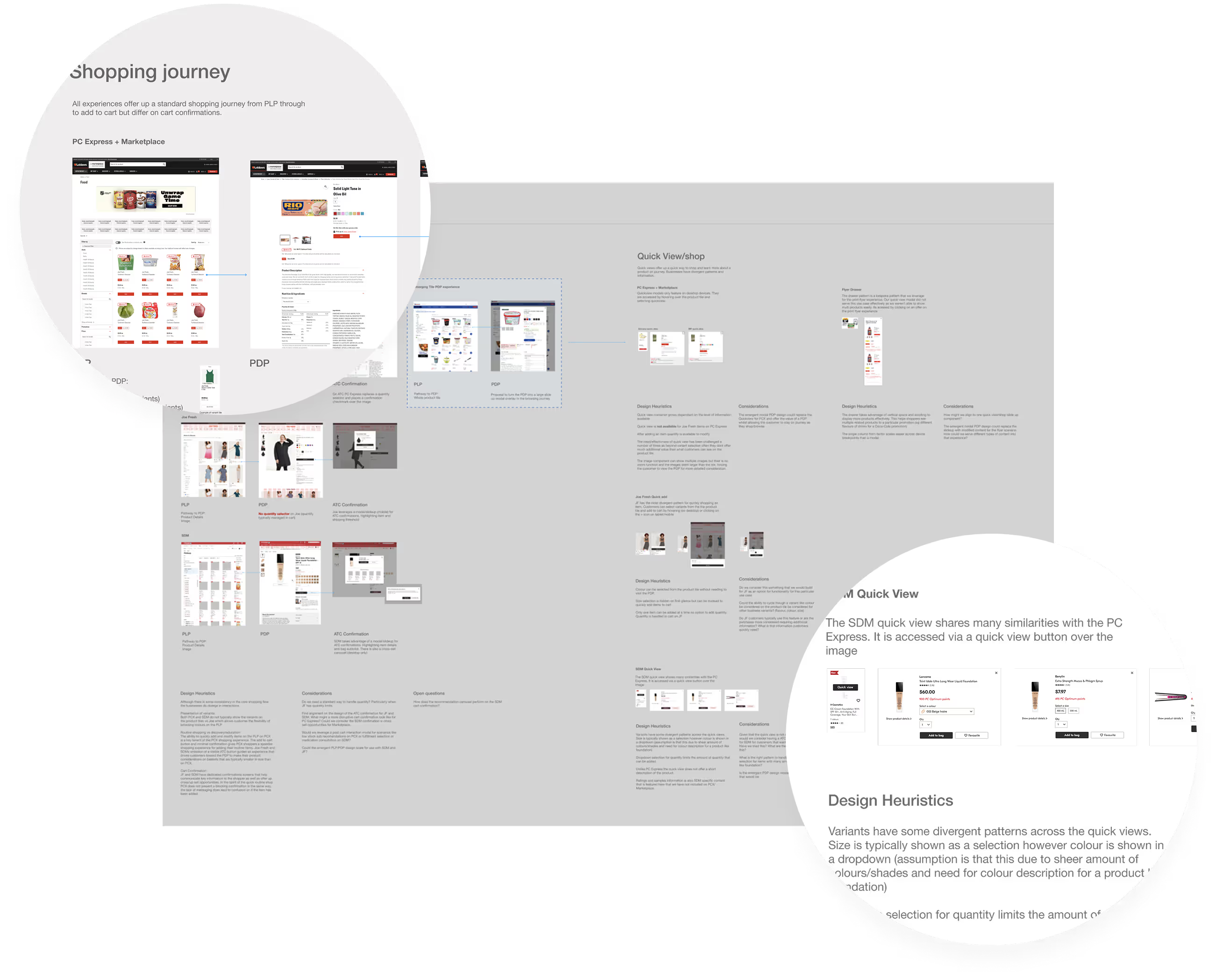
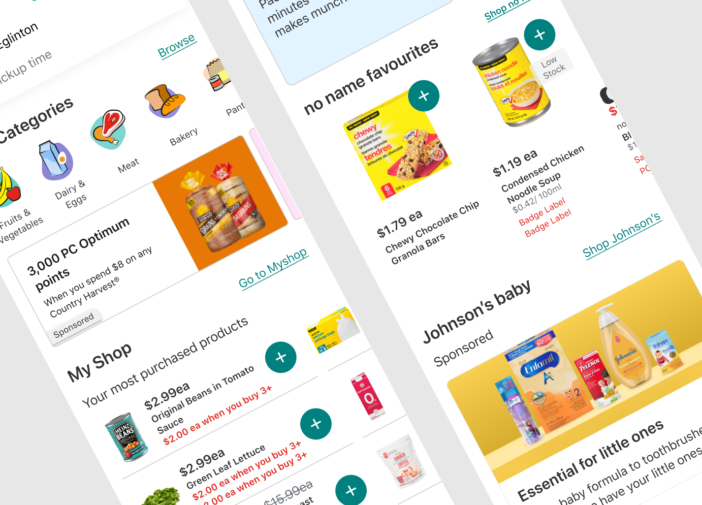
We used our leadership's desire to refresh our PC Express online grocery app to rapidly start exploring designs for a refreshed look and feel that could start serving as some of the foundational atomic elements that we could use to start building our design system component library. To get buy-in from senior leadership and our business stakeholders quickly I helped host weekly async design review sessions with a small group of leaders that left us valuable feedback. We explored new design patterns for our homepage and browse experiences, introduced more content driven merchandising components aimed at empowering our business teams and heavily simplified the overall UI to declutter and refine the look and feel.
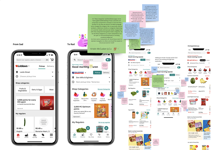
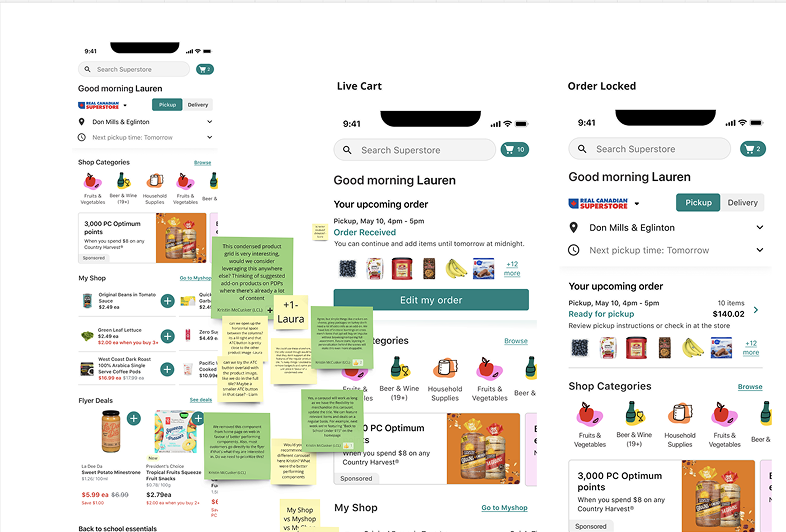
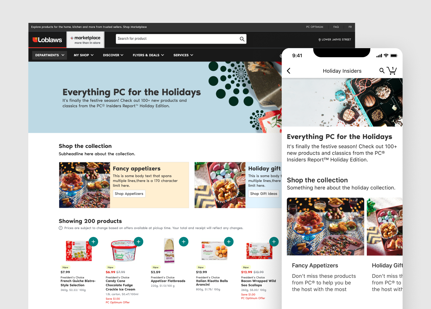
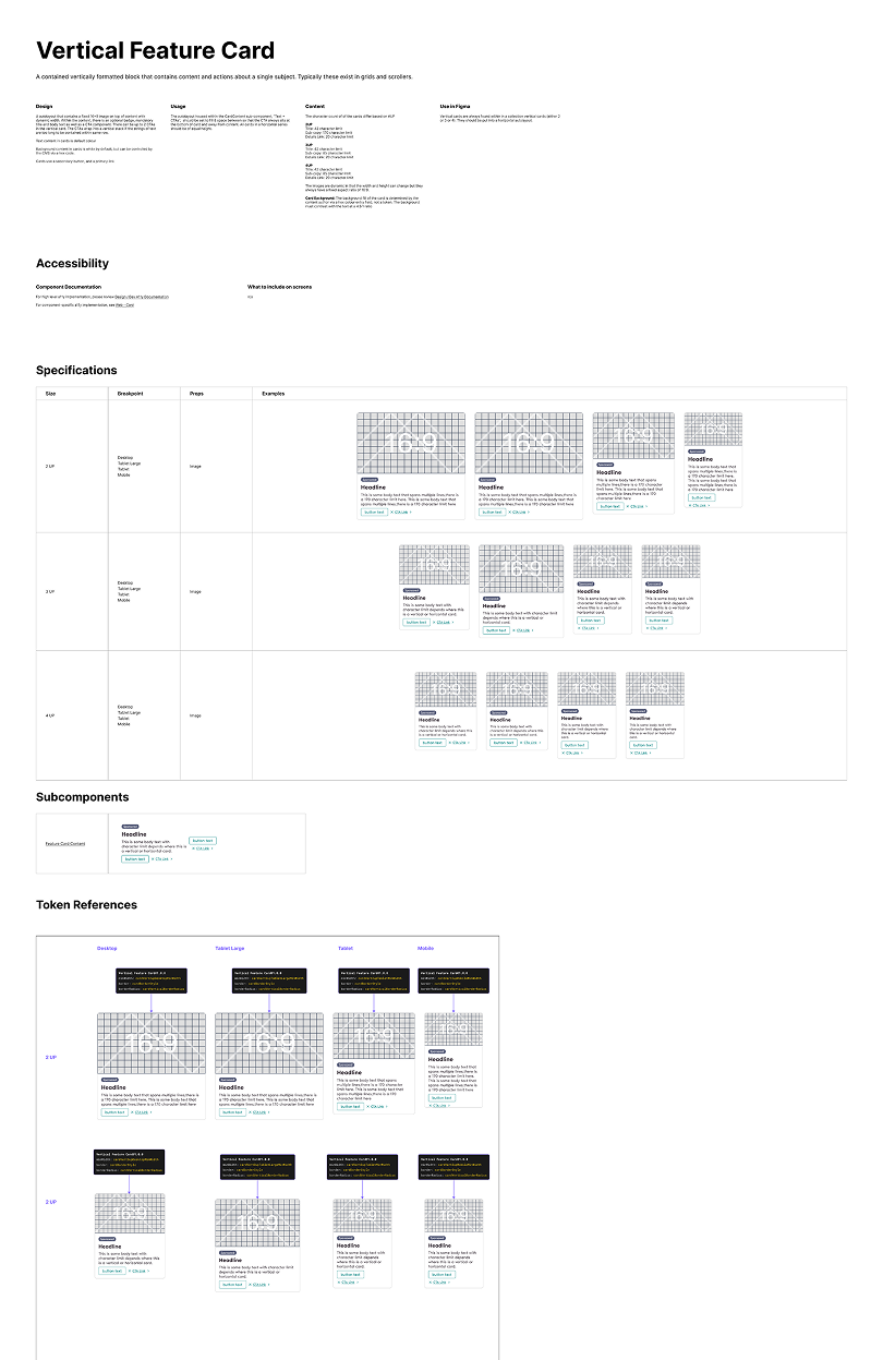
After a period of divergence and momentum built with our leadership team we began to plan an approach to tackle some initial experiences that could serve as the foundation for our establishing the component library. We committed to launching new grocery collections pages alongside our annual holiday merchandising campaign and a new homepage, across our web and app experiences. These were the first experiences to be launched using the new SDUI front end platform and design system.
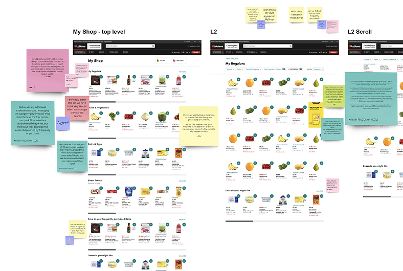
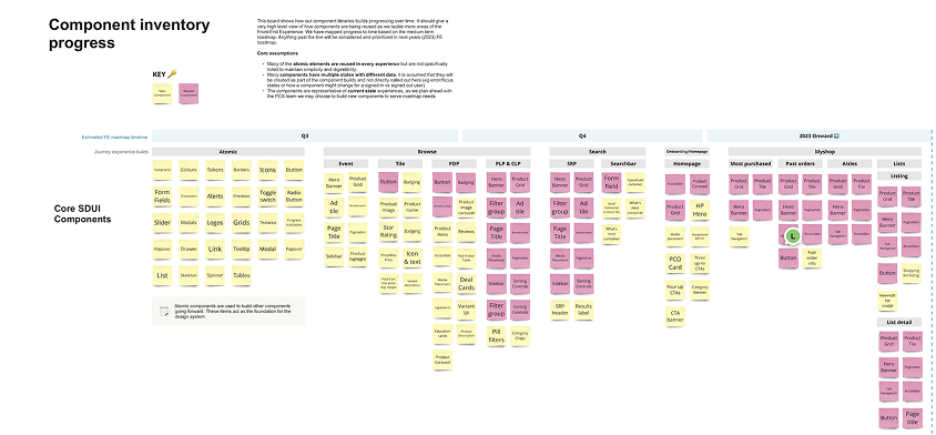
Whilst designing these pages we codified and documented the atomic components that formed the beginning of our reusable component library. I worked with product leadership to engage with business stakeholders to assemble finalized requirements to inform our design activities.
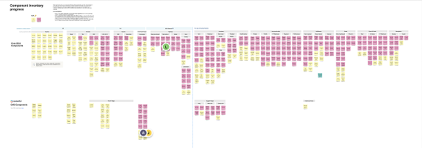
The component inventory map exposed how our front end platform investment reduces new component builds over time to senior leadership
To help us forecast impact, the component inventory map I developed demonstrates how investing in reusable components can scale our library and accelerate new experience development. This artifact showed leadership how the design system roadmap reduces new component builds over time, highlighting increased velocity for future experience builds.
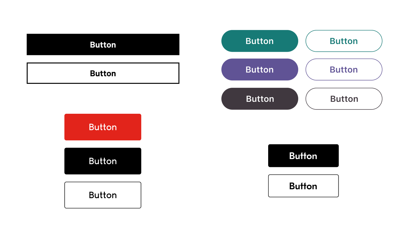
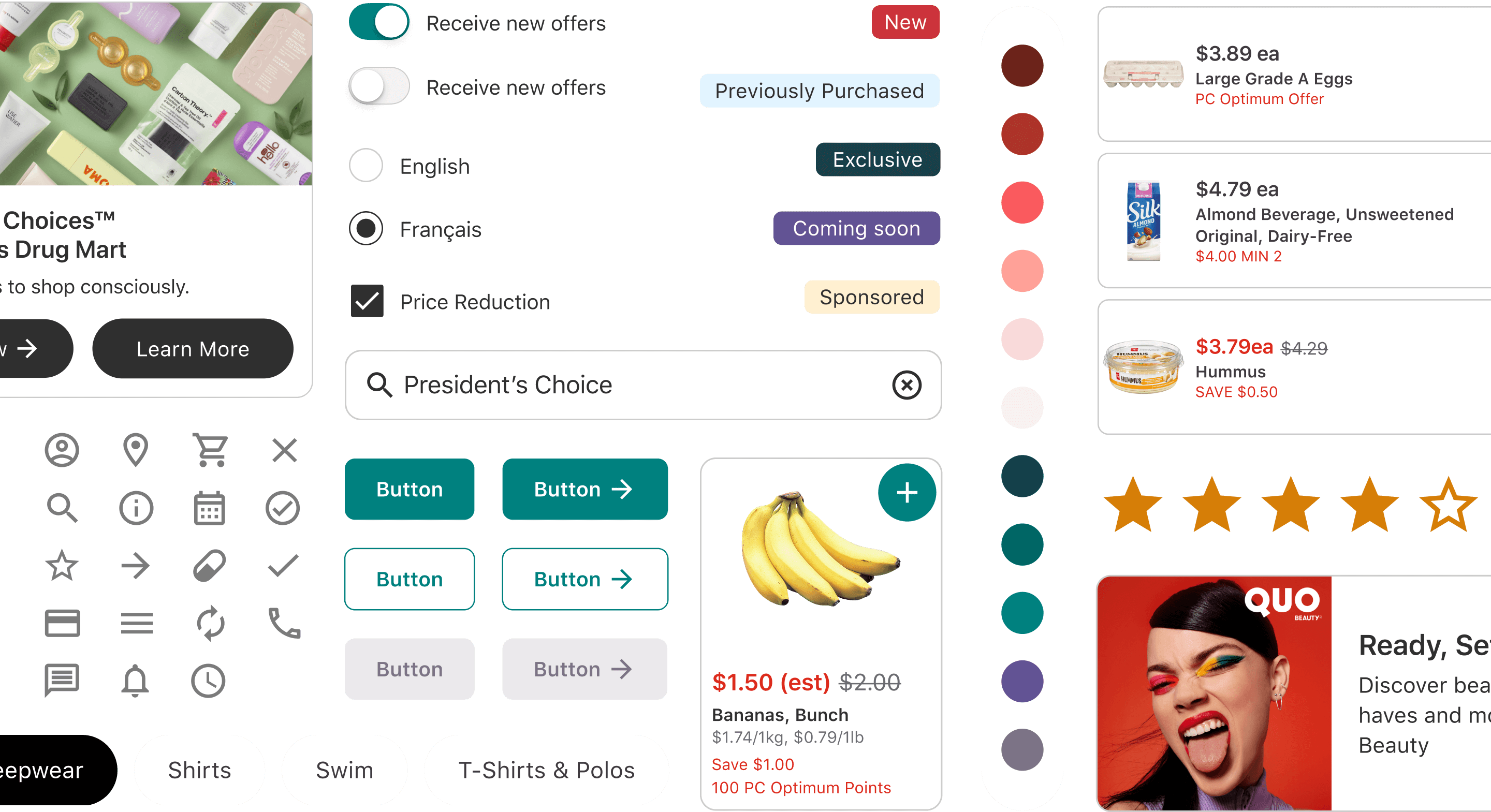
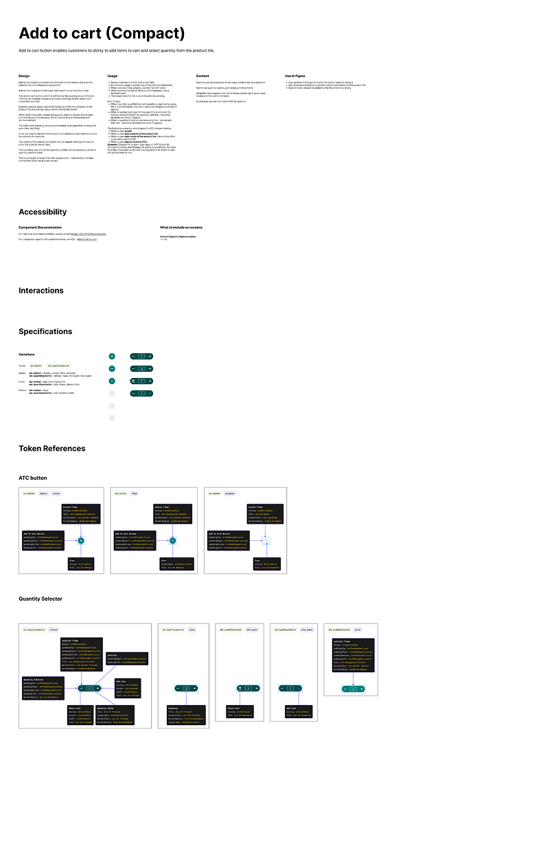
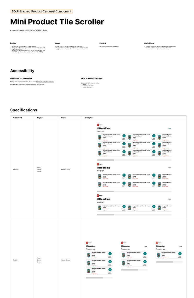
As a team we held regular reviews with tech stakeholders to better understand technical constraints of their new front-end architecture, assist in instituting new ways of working and guiding design handoffs of completed component specs. Tara, JP and myself collaborated closely with James to inaugurate his design system vision with detailed component specs and new design processes. Our developed component specs included comprehensive information about component states, considerations for usage, accessibility guidelines, outlined content models and documented design tokens.

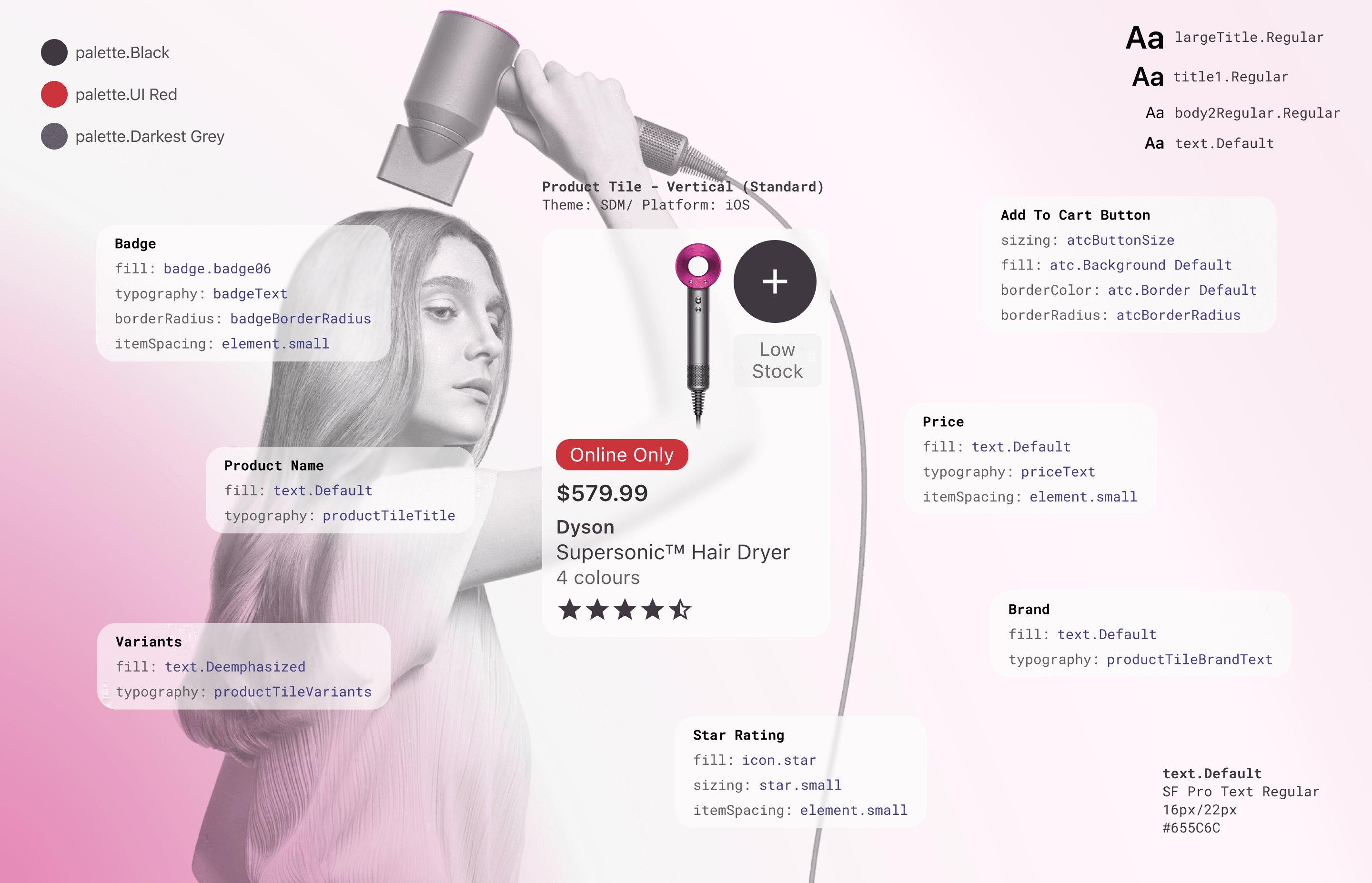
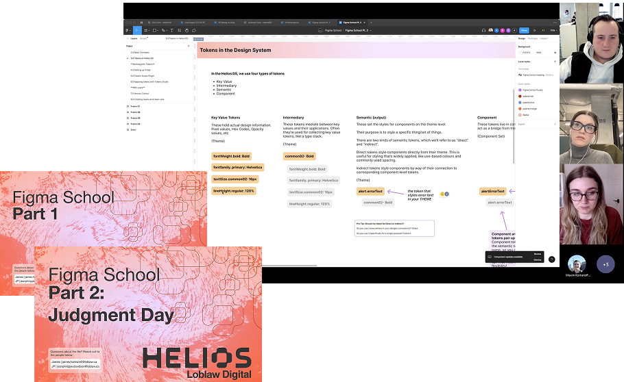
Designing fresh new experiences is exciting and empowering for our team, but we needed to address our key challenges to help us scale, to achieve this we welcomed Design Tokens into our process. Tokens are a way of codifying our design decisions. Colours, Typography, Spacing, Borders, etc can all have associated tokens that act as variables to use over and over again. Keeping designers from having to second guess values when designing new elements and driving consistency. If a change is needed to an element across the system, changing the token makes sweeping changes to patterns automatically throughout our files to keep everything up to date. All of our tokens are grouped into themes which means we can cascade a whole new set of design decisions instantly by changing the theme. Design teams on each of our brands can maintain control over the look and feel of their theme and we’re able to support all of our brands with components in our design system, guided by a standardized set of rules and structures. Great for empowering our design teams efficiency and delivering more consistent patterns and experiences for our users.
Design teams on each of our brands can maintain control over the look and feel of their theme.

However, to truly scale our system these design decisions need to find their way into our codebase (remember those development challenges). Practically they needed to make their way out of Figma and into the hands of our developers more efficiently. We solve this by sharing token information with our development team directly in a shared repository used by designers and developers alike. Our designers can leverage a plugin to create and manage design tokens.
This token information is then transformed into JSON code and delivered to our front-end components. This gives designers the capability to make those small edits or changes anytime they like by pushing updates to the repo (no more tweaks buried in the depths of the backlog). New components or improvements to components or patterns can be inherited immediately by any teams that want them. This takes a lot of the guesswork out of development with more seamless efficient developer handoff, elevating quality and craft of our coded elements. Big wins for designers and developers all round.
After launching our initial components, other teams across the organization saw an opportunity to leverage our system to accelerate their own roadmaps. We recognized that broader adoption would drive velocity, so we partnered with business leads to identify use cases and scale our system.
A key opportunity emerged with Shoppers Drug Mart, our health and beauty retailer, which was migrating key marketing pages from a vendor-supported platform to an enterprise-owned CMS. This transition provided the perfect moment to expand our system, validate its scalability, and support a new line of business.
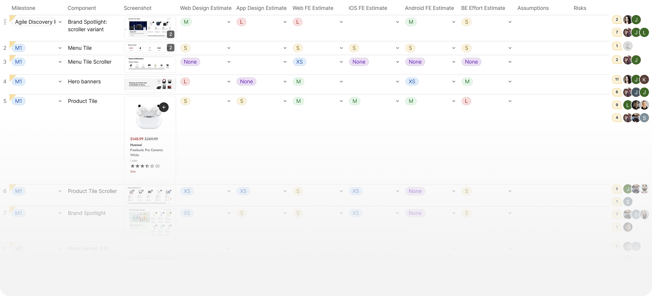
I developed a cross-functional planning document that enabled our teams to understand effort, capture estimates and establish key project milestones.
As the platform design lead, I worked closely with product and design leaders on the Shoppers team to define what was available, what needed iteration, and where new components were required. I consolidated these needs into a cross-functional planning document to align priorities and estimate shared milestones. I also established ongoing one-on-one meetings with Product Design leaders across the organization, helping them navigate process changes and uncover deeper insights into how our work impacted their teams.
After integrating our components into multiple products, we aimed to scale further. Our roadmap prioritized the full e-commerce journey, starting with browse, cart, and checkout. However, teams had diverse business and roadmap priorities, and our loyalty program followed a different customer journey. To drive adoption, we introduced a contribution model, enabling teams to collaborate and expand our library.
We were adding to team overhead and with that comes apprehension and anxiety.
We hosted guided “Figma School” UX training sessions to teach designers how to use and contribute to the system.
Our new system introduces process changes, requiring designers to follow new principles, manage tokens & themes, and use GitLab for updates. We recognized that we were adding to team overhead and with that comes apprehension and anxiety. We provided curated component sets and “Figma School” learning modules, which our platform team delivered through hands-on UX training sessions.
To ensure seamless integration, we gathered requirements through cross-functional design sprints and co-creation with product designers. With these exercises being led by my team, as a designer leader I helped them strategize on planning for the design sprint exercises to give them confidence in guiding a large cross-functional group to effective outcomes.
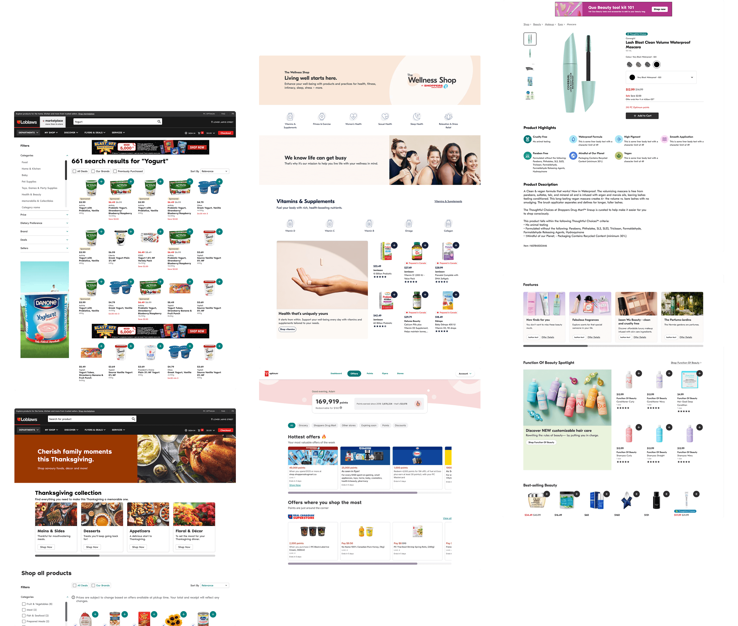
Our design system powers experiences across five lines of business in the Loblaw portfolio, supporting web, iOS, and Android platforms with over 400+ components. These components drive key revenue-generating experiences, including the PC Optimum loyalty offer feed, paid media placements, and browsing for our three e-commerce brands. The system also enabled Joe Fresh to relaunch their iOS app from the ground up in under a year through component contribution. Looking ahead, the system provides a strong foundation for innovation, including personalization, a unified cart and checkout experience, and support for internal colleague tooling across teams.
