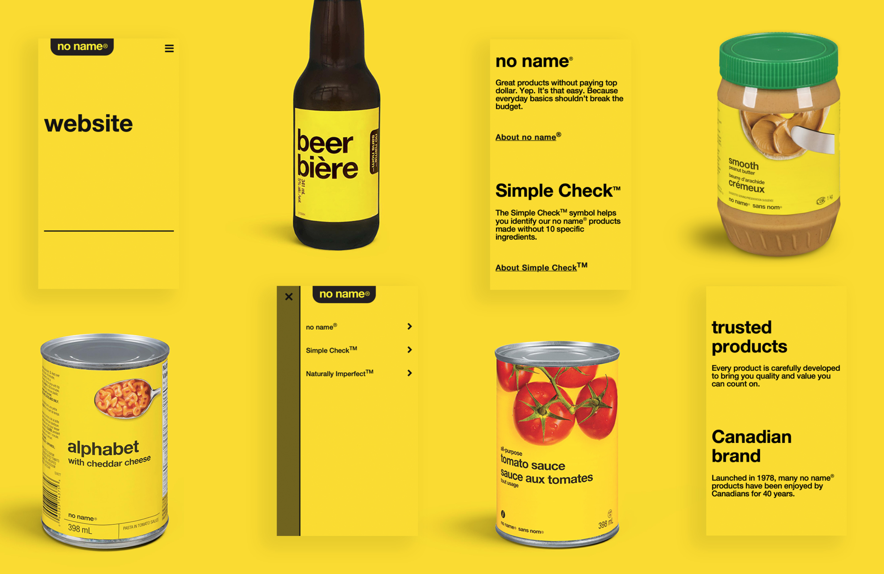
For decades noname has delivered on the promise of giving Canadians honest value and an alternative to high priced competitors. Designed in 1978 by renowned Canadian designer Don Watt, the tell-it-like-it-is brand has used its pragmatic packaging and candid product naming endear itself to shoppers across Canada.
When Loblaw’s noname brand team approached us at Loblaw Digital, they expressed the desire to build a website that communicated the brand’s continued promise and values. The biggest question we asked ourselves was: how do we successfully express such an iconic Canadian brand digitally?
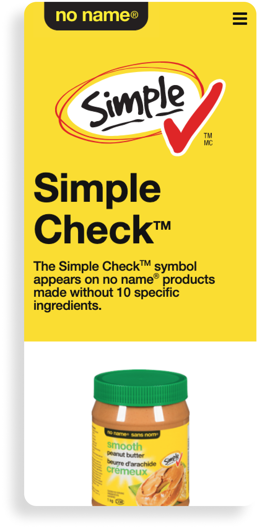
Our main objective was to communicate the brand's new core initiative. “Simple Check,” is a new identifier given to products free of objectionable ingredients typically found in value-based products and commitment to quality. Additionally we needed to create functionality that would link customers to curated noname sections on the users’ favourite Loblaw store banner sites. A simple three page site made outlining the IA, user flows and actions relatively easy.
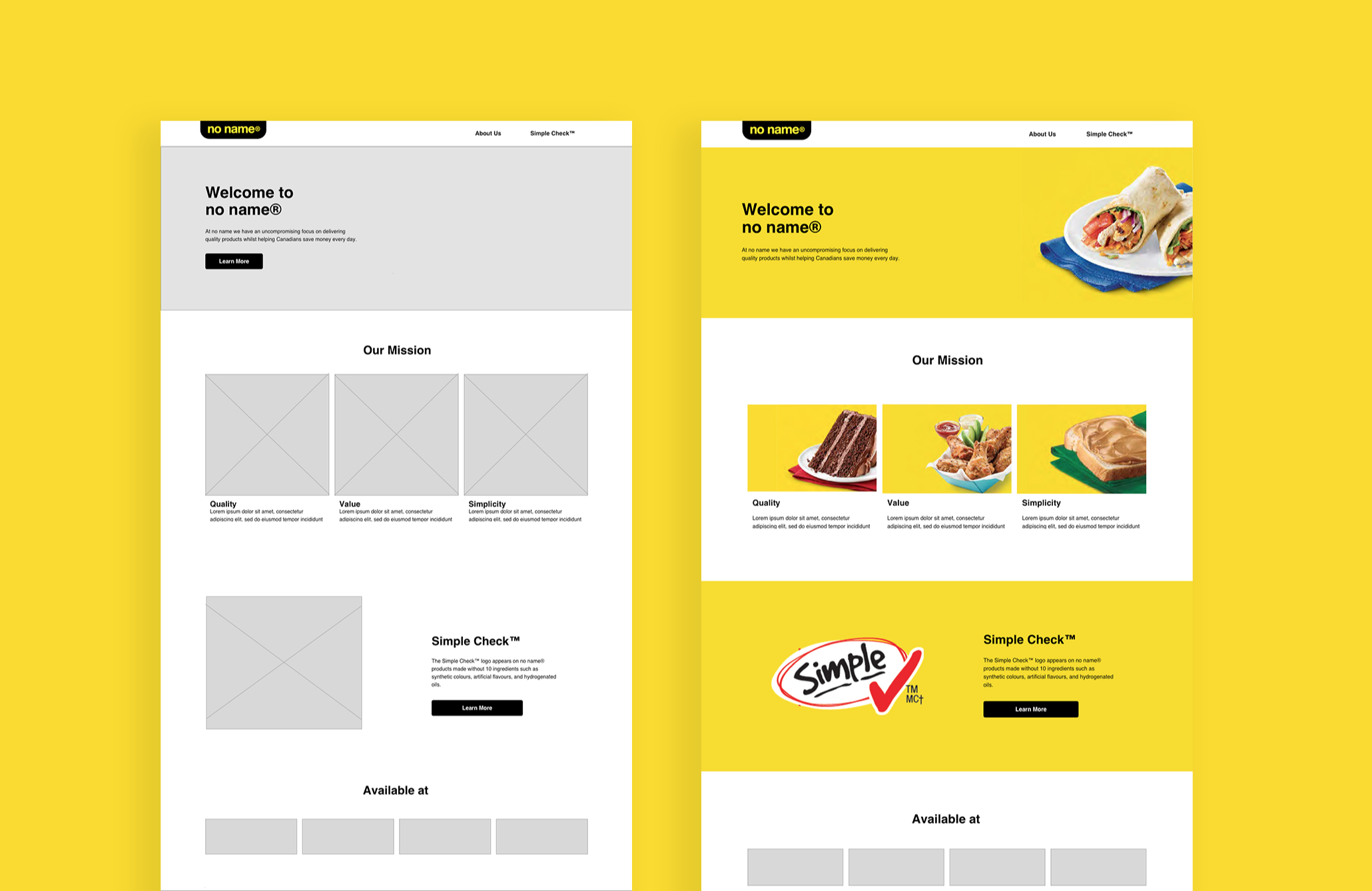
As we began to explore visual design things got challenging:
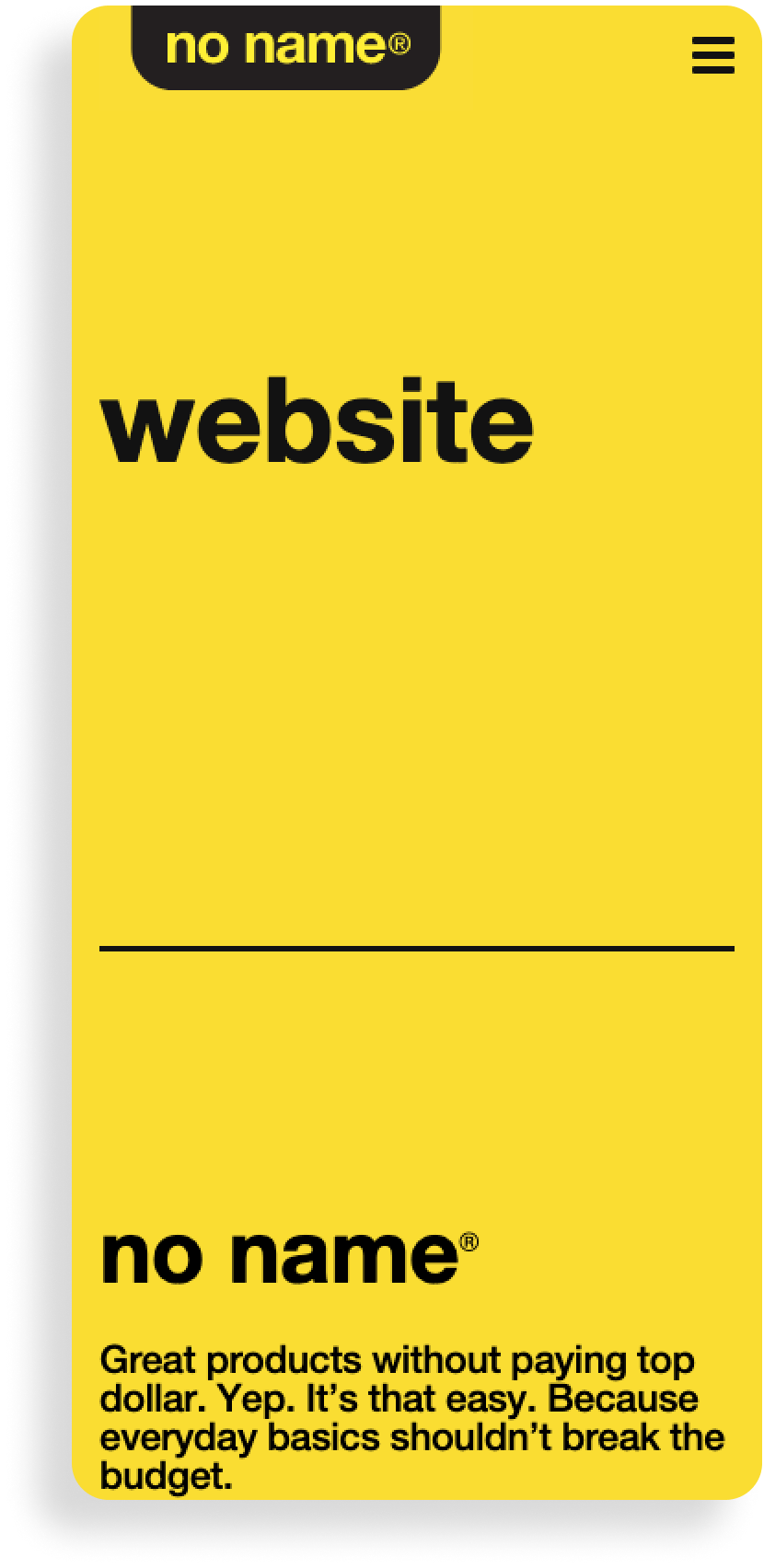
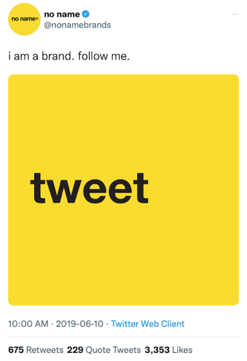
Feedback on our initial iteration was that there was too much visual decoration and we needed to figure out how to scale back the design. During our explorations I casually made a joke that we should just make the main heading “website”, thinking that was too ridiculous. However, the same idea came up in discussion with our brand stakeholders. That candidness was actually exactly what the site needed to express the brand voice. We had the feedback we needed to try another round of design, where we focused more closely on mimicking the iconic product packaging in the true spirit of the original brand.
“What if we made the main heading “Website”? Is that ridiculous?”
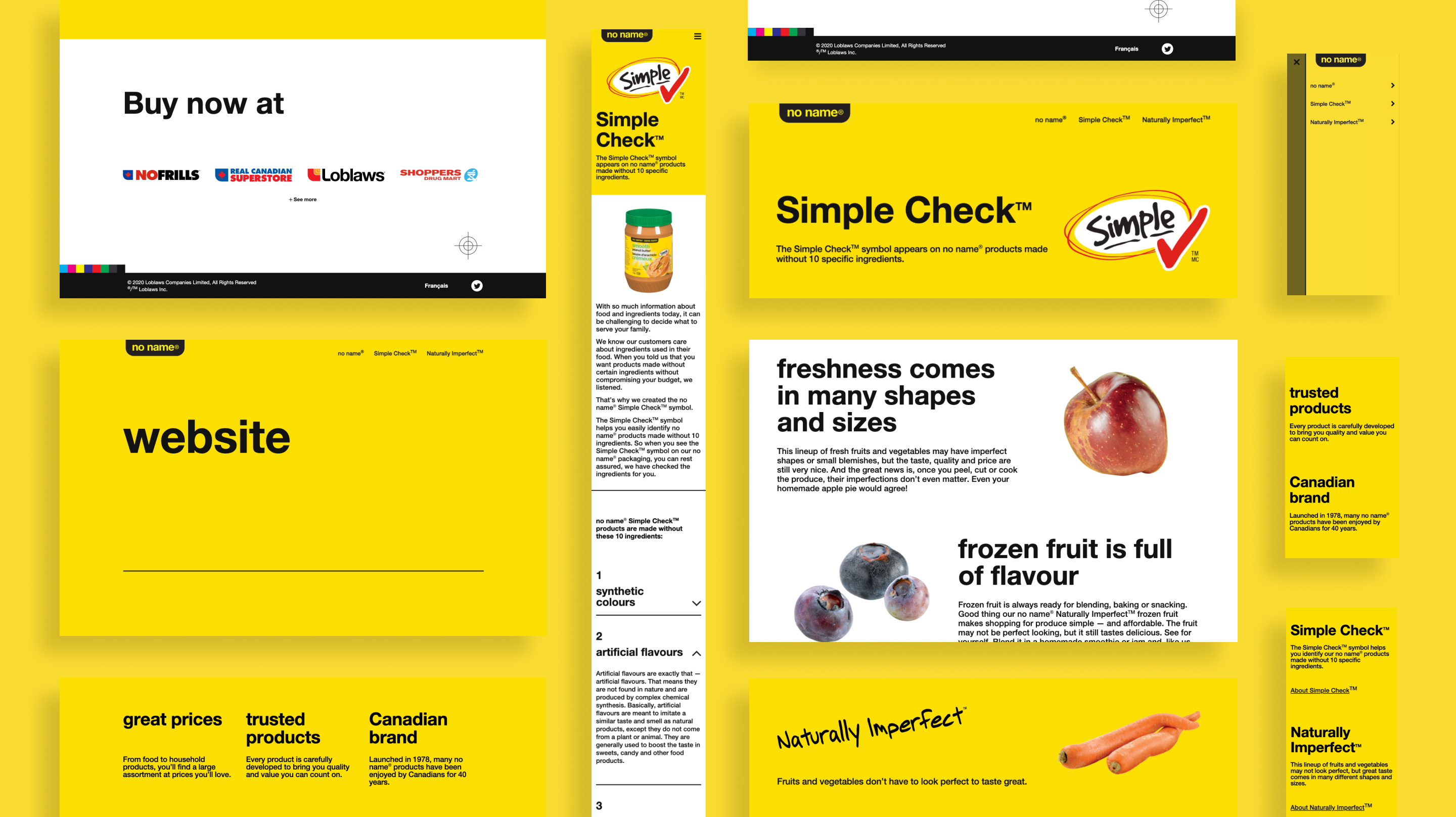
With our finalized design we didn’t feel confident that testing would go well. A site with little imagery and a very stark yellow and back colour scheme, is this something customers will want to engage with? Whilst being true to the noname brand we felt that it didn’t match up with people’s expectations of a modern website. We were pleasantly surprised from our testing that customers loved the yellow and black colour scheme, they had no trouble navigating the site and thoroughly engaged with the content. Most importantly most agreed that the site was a true digital expression of the brand they loved.
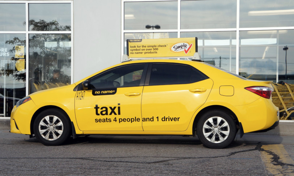
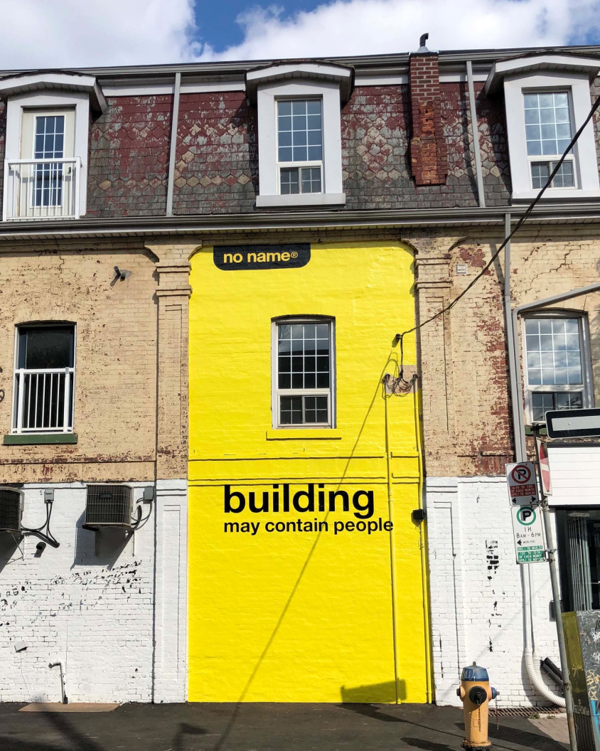
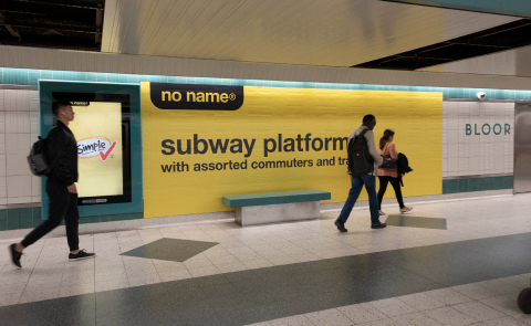
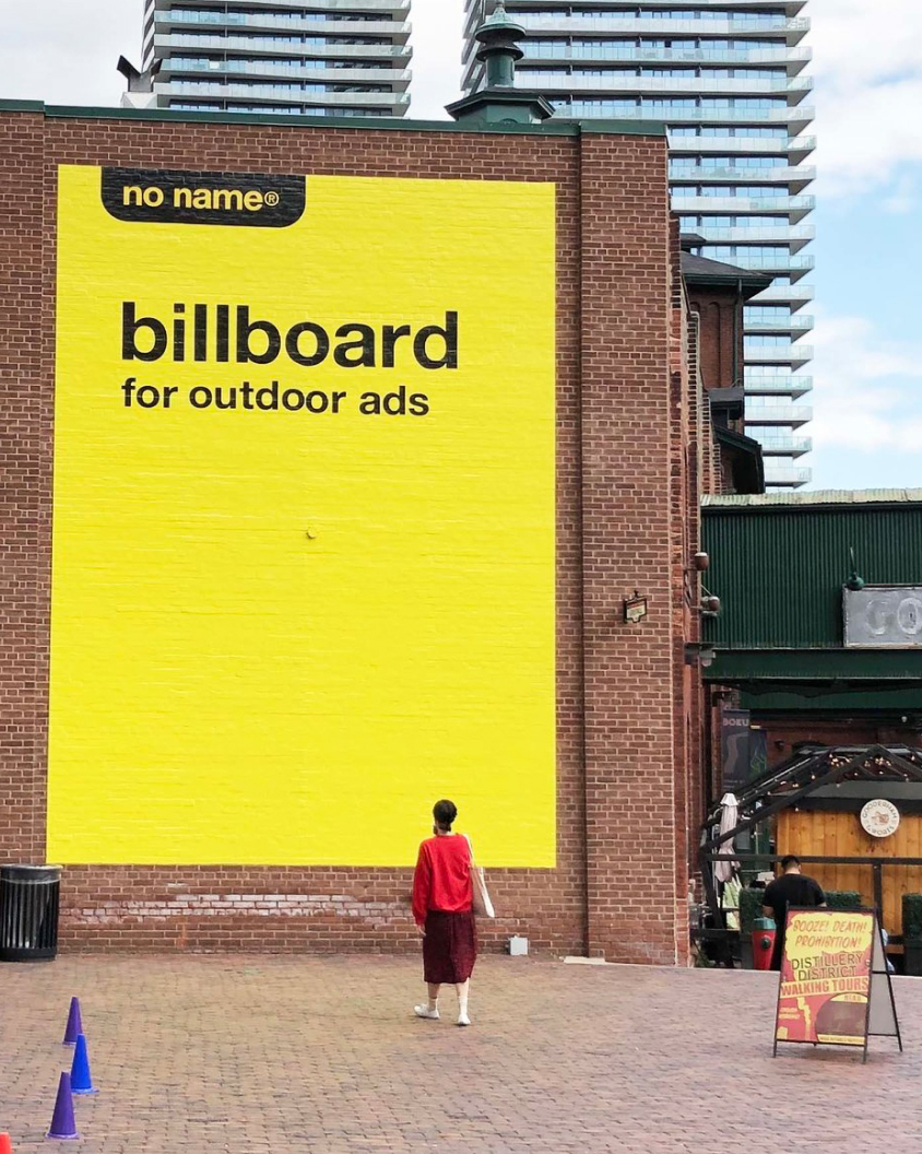
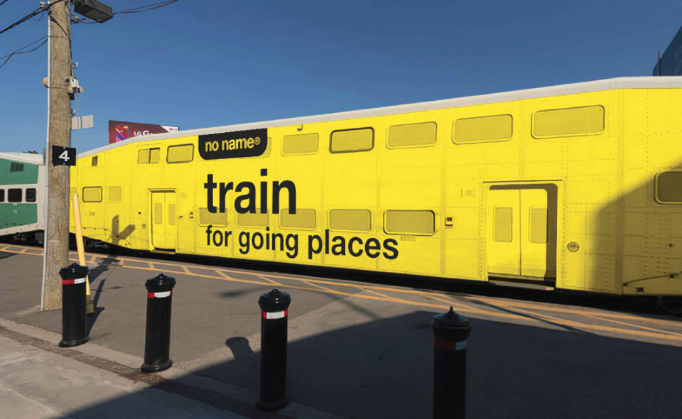
As we were launching a new channel for the brand with a message around product quality, it was tempting for us to evolve the visual language with trends and patterns more inline with modern digital design. In our case with noname we really saw and understood the power of nostalgia, mimicking the iconic packaging enabled us to tell new stories on new channels that still felt authentic and familiar.
